GradientLab field guide
Make a Metallic-Looking Gradient with Waves, Ripples and Glow
Metal Joy starts as a six-color linear gradient. Bend, Wave and Ripple reshape the bands into fine, curved streaks; Glow lifts the highlights. Despite the name, this design does not use the Metallic material. Here is the still-image recipe, with real exports from each stage.
View Metal Joy and open the editor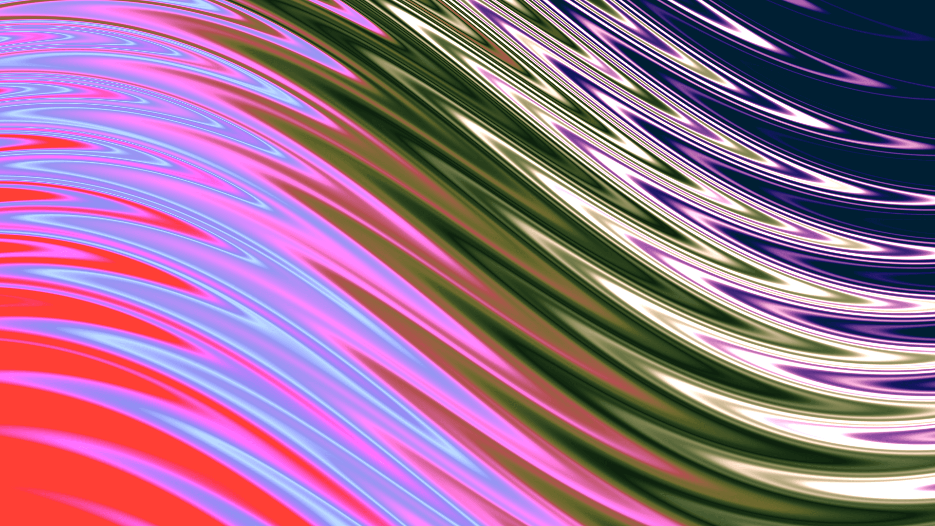
1. Start with six colors
Open the public Metal Joy page above. Sign in, then use Open & Edit to make your own copy; the owner sees Open in Editor. If sign-in returns you to the public page, click the editor action again. On desktop, the loaded design should read Linear, 135°, with a 1920 × 1080 canvas.
To build from scratch, choose New project → New Gradient. Set the canvas to 1920 × 1080, choose Linear and set Angle to 135°. Keep Offset X and Y at 0, Scale at 100%, and Repeat at None. Leave materials and animation off.
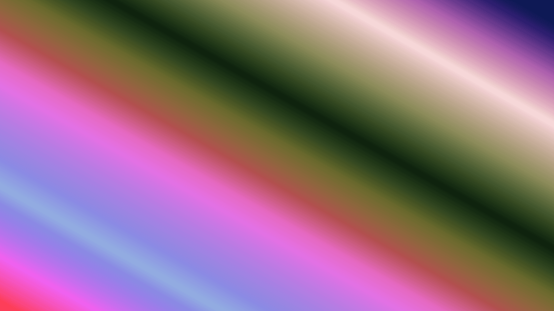
Add these six stops, in order: #FF4035 at 0%, #93AEE1 at 20%, #E569C0 at 40%, #0D200D at 60%, #F9DDDE at 80%, and #001F33 at 100%. The dark green and navy are important: the bright colors need those darker bands to read as reflective streaks later.
2. Bend the broad bands
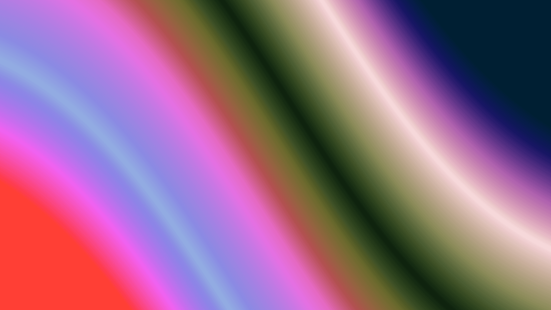
In Design → Warp, enable Bend. Set Amount to 24, Axis to 8°, and Pinch to 0. Click a numeric value to enter it precisely. Keep Wave and Ripple off while you inspect this stage.
The diagonal bands now curve across the canvas. This is the large-scale shape underneath the much finer pattern in the finished image. Turn Bend off and on to compare it with the plain palette.
3. Add Wave and Ripple
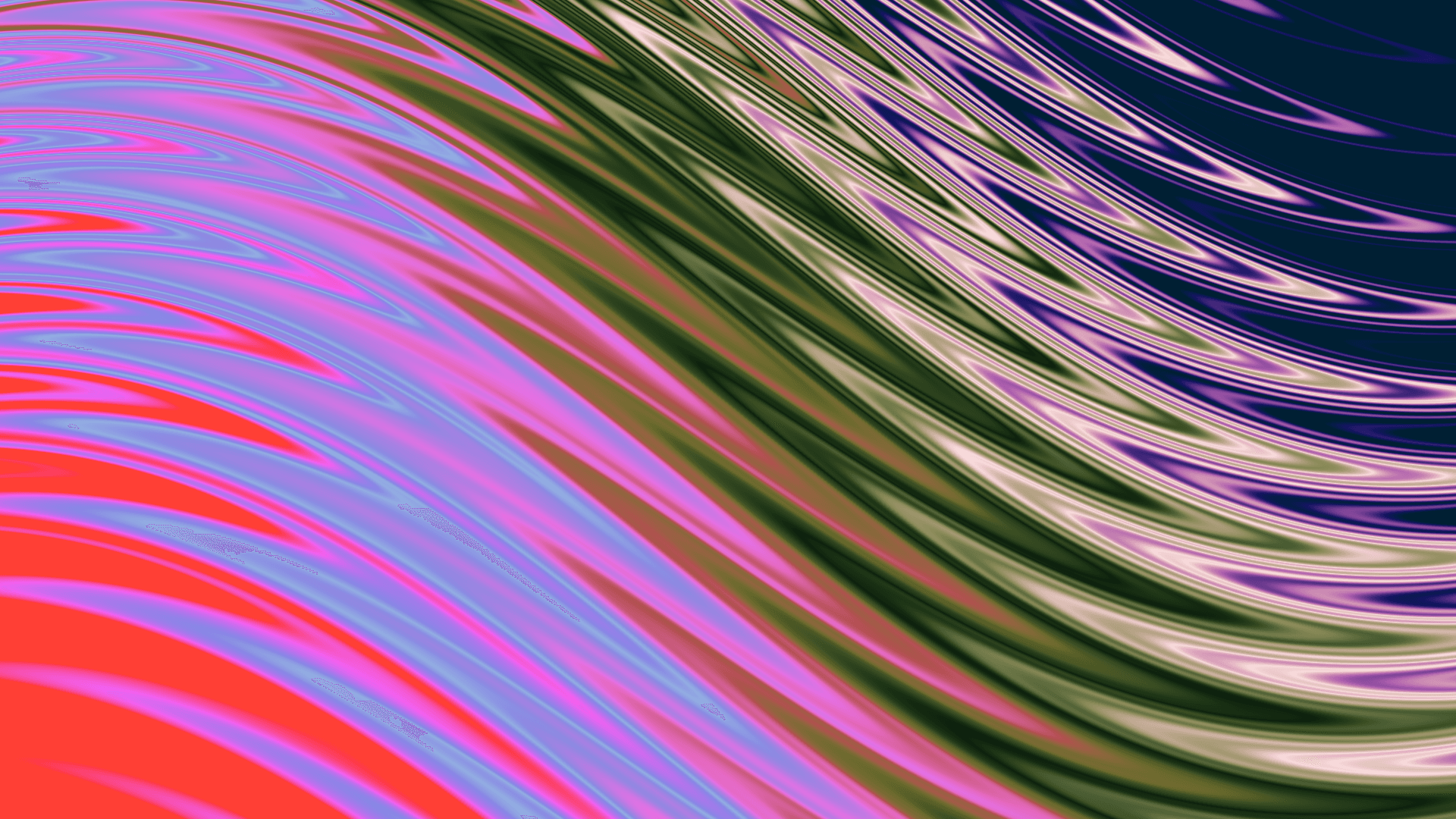
Keep Bend enabled. Enable Wave and set Amplitude to 40, Frequency to 5, Direction to H (horizontal), and Rotation to 0°.
Enable Ripple: Amplitude 60, Frequency 3, Center X 27%, Center Y 15%, and Decay 35. Leave other warps and geometry effects off. The saved design also has Blur enabled at 0, which adds no visible blur.
The fine lines and sweeping arcs come from these combined warps, not a metallic texture or material. If your result is still mostly broad bands, check that both Wave and Ripple are enabled, not just expanded in the controls.
4. Finish with Glow
In Effects, enable Glow. Set Amount to 45, Threshold to 50, and Radius to 30. Leave the other effects off. The brightest streaks gain a lighter halo; the main shapes should stay the same.
Compare the result at the size where it will be used. The fine lines may compete with small text. For a background, place text on a separate solid panel or choose a quieter crop in your layout; do not rely on every part of this artwork to provide readable contrast.
5. Export a still and check the file
Choose Export → PNG and Scale 1x. Check that the output dimensions match the canvas before selecting Export PNG. Wait for the export to finish before changing any effects; otherwise you can end up exporting the next stage rather than the one you intended.
We verified this recipe in the live editor on September 14, 2026. The finished PNG from the account used for this walkthrough is 1920 × 1080 pixels and 3,980,838 bytes (about 4 MB). That is one measured export, not a promise of file size or plan entitlement. Free and paid accounts have different output limits; consult the export-format guide below.
Keep the full-quality export for design work. For a website, deliver an appropriately sized image and inspect the optimized result for banding and loss of the fine lines. This walkthrough is a still: it does not demonstrate a seamless animation or an editable CSS or GLSL export.
If your result looks different
First compare the canvas ratio, 135° angle and six color-stop positions. Then check the active controls: Bend, Wave, Ripple and Glow. Metallic, Iridescent, Holographic and Velvet should all remain off.
If the editor shows an older project, check that Metal Joy or your remixed copy is the active tab. Keep any existing unsaved tabs; you do not need to delete them. If opening the artwork fails, use the visible retry action rather than assuming the old canvas is the requested design.
If the exported stage is wrong, wait until all intended switches and values are visible, export again, and leave the controls alone until the download completes. Compare the downloaded image, not only the preview.